🕣 Duration: 1.5 years

Building a Better Game: Supporting English Football from Grassroots to Elite

Building a Better Game: Supporting English Football from Grassroots to Elite

English Football Learning, the FA's official platform, supports players, coaches, referees, and football professionals with educational resources, training, certifications, and tools for skill development at all levels, from grassroots to elite.

Impact

Impact

74%

74%

Increase in the average monthly page views during the first month after launch, compared to the average views from the previous learning site, measured between Sept – Oct 2022. A notable achievement for a new site.

141%

141%

A 5.5 million increase in interactions with content by June 2023, since launch in Sept 2022. This represents 141% of our target.


188%

Increase in returning visitors: Due to valuable and easy access to learning materials.

My Responsibilities

  • Product Designer

  • Led end-to-end UX design from discovery through post-launch optimization

  • Conducted and synthesised research (competitive analysis, usability testing, analytics)

  • Designed and iterated on wireframes, user flows, and visual design

  • Collaborated directly with FA stakeholders to balance user needs with business goals

Why This Project Mattered


The legacy Bootroom platform had a declining monthly active users. The FA was losing grassroots coaches to competitor platforms and risked their position as the authoritative source for English football education. This redesign was strategic: retain existing users, attract new grassroots coaches, and establish a foundation for future digital products.

The Challenge

The Challenge

Findings

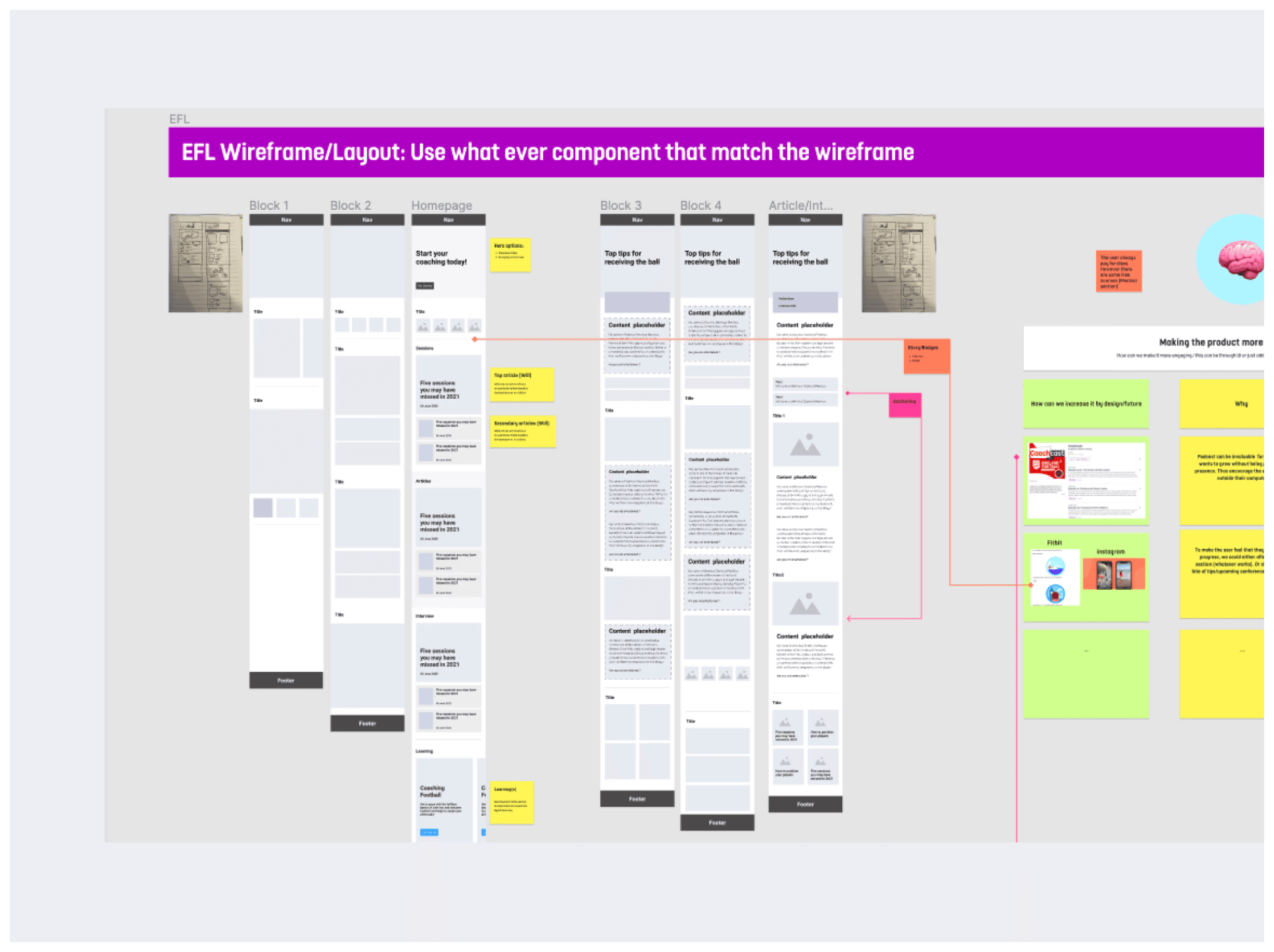
Problem 1: Lack of Information Structure

"I come here to find training resources for under-12s. After 15 minutes of clicking around, I just Google it instead. As im not sure where to find relevant information
— User interview, grassroots coach"

Problem 2: One Size-Fits-All Experience

Coaches, referees, and players all saw the same homepage. A referee looking for rule updates had to wade through coaching content, and vice versa. Our hypothesis: personalisation would improve time-to-content.

Problem 2: One Size-Fits-All Experience

~57% of traffic was mobile, but the experience was a desktop-first responsive design that barely functioned. Coaches were trying to access session plans pitch-side on their phones — our primary use case was failing.

Design Phase

Design Phase

Step 1

Thematic Analysis

Step 1

Thematic Analysis

I led a thematic analysis by I synthesised insights from user surveys, web analysis, to identifying recurring pain point patterns. These insights was was then used to conduct UX audit to

With the help of the thematic analysis i was able to take the steps that the user take and identify the friction points before recommending design changes. This audit with the help of the thematic analysis was then used to design user personas.

Step 2

UX Audit & User Personas

With the help of the thematic analysis i was able to take the steps that the user take and identify the friction points before recommending design changes. This audit with the help of the thematic analysis was then used to design user personas.

Step 2

UX Audit & User Personas

With the help of the thematic analysis i was able to take the steps that the user take and identify the friction points before recommending design changes. This audit with the help of the thematic analysis was then used to design user personas.

Addressing Excessive Back-Button Use

Noticed excessive browser back-button use in session recordings, indicating users were browsing to discover rather than searching for known items—a flaw requiring design changes.

Incomplete Search


The existing search system led to increased user effort (scrolling and retyping) because of a poor tagging system and a catch-all result logic. This broad logic displayed any content containing the keyword, leading to low relevance and search inefficiency.

💡Solution


This insight directly shifted our design strategy from focusing on "better search" to prioritising discovery by implementing:

  • personalised home that highlights different coaching interests.

  • clear category navigation system

Step 3

Priority Matrix — What We'd Build and Why?

Working with the product team, I created a prioritised roadmap. that outlined which features and sections would be prioritised development. This ensured both teams stayed aligned on what to tackle first and why, balancing user needs with business goals.

Step 4

Design Exploration 

Building on the analysis, I translated the early insights into IA and wireframes, defining core functionality guided by the Action Plan and user personas. This was then used to design user flows and alyout that best emulate solutions to the users main challenges

Step 5

Competitive Analysis

Conducted competitive analysis to guide product value improvements and feature implementation. Based on these insights and collaboration with the design team, we successfully introduced Session and In-Page Quizzes integrated with the user's learning path.

Step 6

User Research

I collaborated with the User Researcher on usability testing, uncovering critical issues users missed the Get Started section and struggled with the floating menu. I captured detailed observations and follow-up insights, which directly informed design adjustments to improve discoverability and task completion.

Step 7

Design Iterating 

Following user research, we made several design improvements that had a significant impact on the overall experience — most notably the filtering system.

BEFORE: Floating Filter Menu

We increased the Session page's layout for more content, but it performed poorly. Only 7/10 desktop users located the floating filter, and 3 of those 7 struggled with the exact location. We then implemented a traditional sidebar filter menu. A follow-up study showed significantly higher performance with a 10/10 success rate in user task completion.

After: Sidebar Filter Menu

We first tested a floating filter to maximise content space, but only 7/10 users located it easily. Switching to a sidebar filter improved task completion to 10/10 — showing that visibility outweighed minimalism and informing our design system to favour discoverability over visual simplicity.

Final Design

Personalise Your Learning: A homepage tailored to user objectives.

Interactive Learning: An engaging and enjoyable way to quickly gain informal knowledge.

Learner Profile: A central reference point that connects users to relevant content across the entire
FA learning ecosystem and professional network building.

Learner Profile: A central reference point

that connects users to relevant content across the entire FA learning ecosystem

and professional network building.

“Thanks for all your hard work across all our projects Anthony - Its been a pleasure working with you and having your input into our calls. Your work goes unseen to us on the business side.”

Nick Baker, Senior Lead of Education, The Football Association (The FA)

“I wanted to express our heartfelt gratitude for the exceptional work you have contributed for the past three years. Your dedication, creativity and expertise in UX has been instrumental in our success and set a standard here at FA.”

Amre Basama, Product Owner, The Football Association (The FA)

Why This Project Mattered


The legacy Bootroom platform had a declining monthly active users. The FA was losing grassroots coaches to competitor platforms and risked their position as the authoritative source for English football education. This redesign was strategic: retain existing users, attract new grassroots coaches, and establish a foundation for future digital products.

My Responsibilities

  • Led end-to-end UX design from discovery through post-launch optimization

  • Conducted and synthesised research (competitive analysis, usability testing, analytics)

  • Designed and iterated on wireframes, user flows, and visual design

  • Collaborated directly with FA stakeholders to balance user needs with business goals

Findings

Findings

Step 3

Priority Matrix — What We'd Building and Why?

Working with the product team, I created a prioritised roadmap. that outlined which features and sections would be prioritised development. This ensured both teams stayed aligned on what to tackle first and why, balancing user needs with business goals.

Step 4

Design Exploration 

Building on the analysis, I translated the early insights into IA and wireframes, defining core functionality guided by the Action Plan and user personas. This was then used to design user flows and alyout that best emulate solutions to the users main challenges

Step 5

Competitive Analysis

Conducted competitive analysis to guide product value improvements and feature implementation. Based on these insights and collaboration with the design team, we successfully introduced Session and In-Page Quizzes integrated with the user's learning path.

Step 6

User Research

I collaborated with the User Researcher on usability testing, uncovering critical issues users missed the Get Started section and struggled with the floating menu. I captured detailed observations and follow-up insights, which directly informed design adjustments to improve discoverability and task completion.

Step 7

Design Iterating 

I collaborated with the User Researcher on usability testing, uncovering critical issues users missed the Get Started section and struggled with the floating menu. I captured detailed observations and follow-up insights, which directly informed design adjustments to improve discoverability and task completion.

BEFORE: Floating
Filter Menu

We increased the Session page's layout for more content, but it performed poorly. Only 7/10 desktop users located the floating filter, and 3 of those 7 struggled with the exact location. We then implemented a traditional sidebar filter menu. A follow-up study showed significantly higher performance with a 10/10 success rate in user task completion.

After: Sidebar Filter Menu

We first tested a floating filter to maximise content space, but only 7/10 users located it easily. Switching to a sidebar filter improved task completion to 10/10 — showing that visibility outweighed minimalism and informing our design system to favour discoverability over visual simplicity.

“Thanks for all your hard work across all our projects Anthony - Its been a pleasure working with you and having your input into our calls. Your work goes unseen to us on the business side.”

Nick Baker, Senior Lead of Education, The Football Association (The FA)

“I wanted to express our heartfelt gratitude for the exceptional work you have contributed for the past three years. Your dedication, creativity and expertise in UX has been instrumental in our success and set a standard here at FA.”

Amre Basama, Product Owner, The Football Association (The FA)

Step 1

Thematic Analysis

With the help of the thematic analysis i was able to take the steps that the user take and identify the friction points before recommending design changes. This audit with the help of the thematic analysis was then used to design user personas.

Create a free website with Framer, the website builder loved by startups, designers and agencies.